Adding Styled Text

Contents
Styled Text is a container for multiple lines or paragraphs of formatted text.
To add Styled Text, click Insert – Styled Text, then click the location on the report or label where you want the Styled Text to appear. The following Styled Text properties can be configured:
Name
A unique, assigned name, consisting of the words “Styled Text” plus the first available number (for example, Styled Text 1, Styled Text 2, and so on), by default. You can also give your own, unique name to the component for ease of reference when using event methods.
X
The exact horizontal co-ordinate for the top left corner of the Styled Text.
Y
The exact vertical co-ordinate for the top left corner of the Styled Text.
Width and Height
The width and height of the bounding box surrounding the Styled Text.
Value
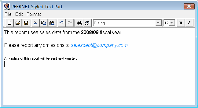
The value contained in the Styled Text component. Click the  button to the right of the Value field to launch the PEERNET Styled Text Pad, where you can input and format your desired text.
Fill Style
The fill setting for the Styled Text (Opaque or Transparent).
Fill Color
The fill color for the Styled Text. To show the fill color, ensure Fill Style is set to Opaque. Click the button to go to the Color Chooser and select a custom color.
Can Grow
If you set this field to Yes the component will be automatically resized if its value is larger than its bounding box. Other components will be shifted to accommodate the size increase. If you set this field to No the component’s value may appear truncated in the bounding box.
Can Shrink
If you set this field to Yes the component will be automatically resized if its value is smaller than its bounding box. Other components will be shifted to occupy any created space. If you set this field to No the component’s bounding box may include empty space.
Propagate Change
The controls the behaviour of the Can Grow and Can Shrink properties and how this component propagates changes caused by another component. When set To the right and below a change in the size/position of this component will affect the position of components to the right and below this component. When set To the right only a change in the size/position of this component will only affect the position of components to the right and will not affect components below this component. When set Below only a change in the size/position of this component will only affect the position of components below this component and will not affect components to the right of this component. When set No a change in the size/position of this component will not affect any other component.
Visible
If you set this field to No the Styled Text will be hidden.
Locked
If you set this field to Locked you will not be able to move the Styled Text by dragging.